Lao Feng Xiang
Lao Feng Xiang
Advertising
-
Lao Feng Xiang's name consists of three Chinese characters representing the phoenix, symbolizing rebirth. When it came time to emerge into the American market and open their flagship Fifth Avenue store, we were asked to help with the transition.
How could a company so deeply rooted in Chinese culture bridge the gap into the American market? We started by creating a logo that included the company name spelled out with Roman alphabet letterforms. We also included the Chinese characters so it would also be recognizable to travelers from Asia.
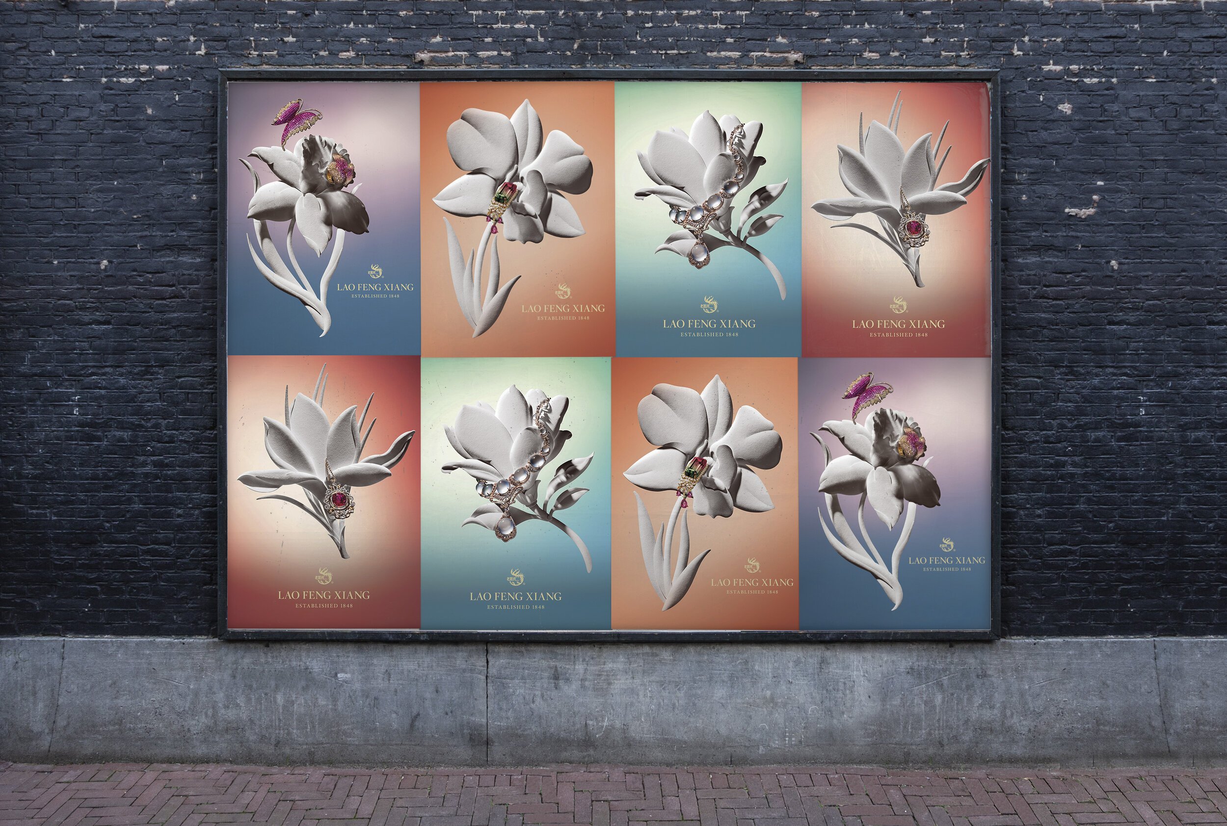
Creating imagery that strikes a similar balance between East and West was the next challenge. Honoring the culture and history of LFX while meeting the sophistication and esthetic of the Fifth Avenue shopper is a task that requires sensitivity. Ultimately we decided on white, cut paper flowers, an ancient, timeless Chinese artform that also symbolizes purity and innocence in Western Cultures.
The three dimensional sculptures were created by paper artist Jeff Nishinaka and provided the perfect backdrop for the LFX jewelry. Each piece gracefully drapes off flower petals, highlighted by elegant, sensuous lighting. The pastel, two-toned backgrounds were created with colored gels placed over lights, blending the subtle hues on the surface below the flowers.