La Mer
La Mer
Packaging Design & Brand Design
-
The beauty giant’s holdings include Aveda, Bobbi Brown, Clinique, Jo Malone, MAC, Origins, Tom Ford Beauty and many others. La Mer is decidedly the jewel in the crown of the Estee Lauder Companies, their most profitable holding with annual billings of 1.2B. The climb to success has been a slow one; at the time of our introduction, Estee Lauder had recently acquired the brand, a 30mm business at retail.
While that is small by comparison to where La Mer has landed, they’ve always had a cult-like following based on the stellar results delivered by the product. At that time, their packaging wasn’t indicative of the quality of the product. A careful risk analysis determined that an upscale overhaul of the packaging would likely win more new fans than alienate existing ones.
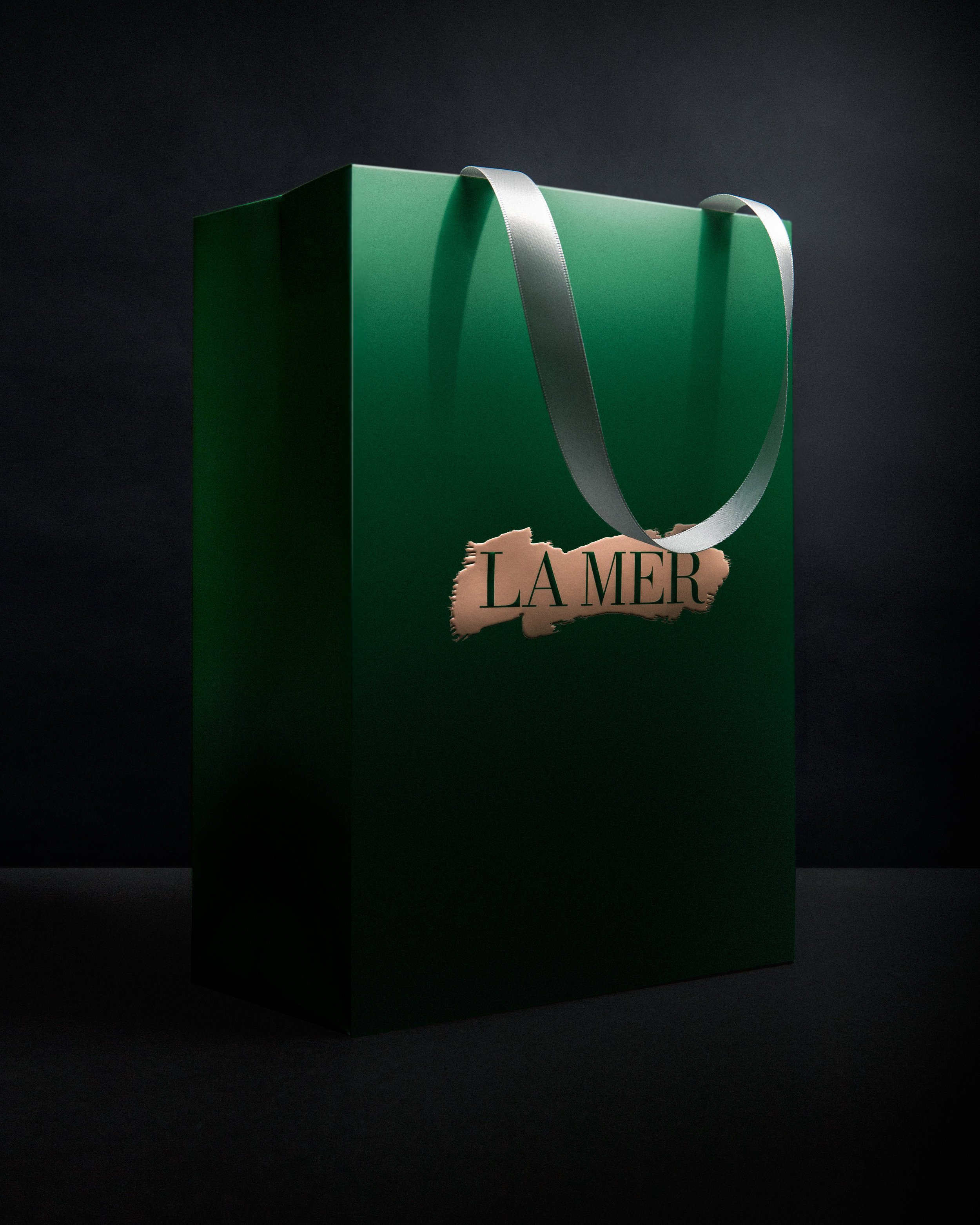
In an effort to remain consistent, the essential structure of the boxes remained the same, a two-piece setup box with platform and telescoping lid. All finishing techniques were upgraded: the thickness of the box was increased, texture was added to the paper, the logo was debossed so that it would pop at retail.
Color scheme was adjusted: their original pink was shifted to blush, and the green was deepened for contrast. The logotype color was changed from white knockout to green, the brushstroke background was enlarged so the type was more legible.
Ultimately, the packaging was quietly elevated, and we achieved the same results that women experience when they use La Mer everywhere in the world; rather than a sweeping change, we initiated a noticeably refined beauty.